How to Create and Edit Tours in Page Pilot Visual Editor
The Tour Visual Editor allows users to create customized tooltip messages with text, visuals, and interactive elements. These tooltips can be used in tours or as single contextual guides.
Screen Layout
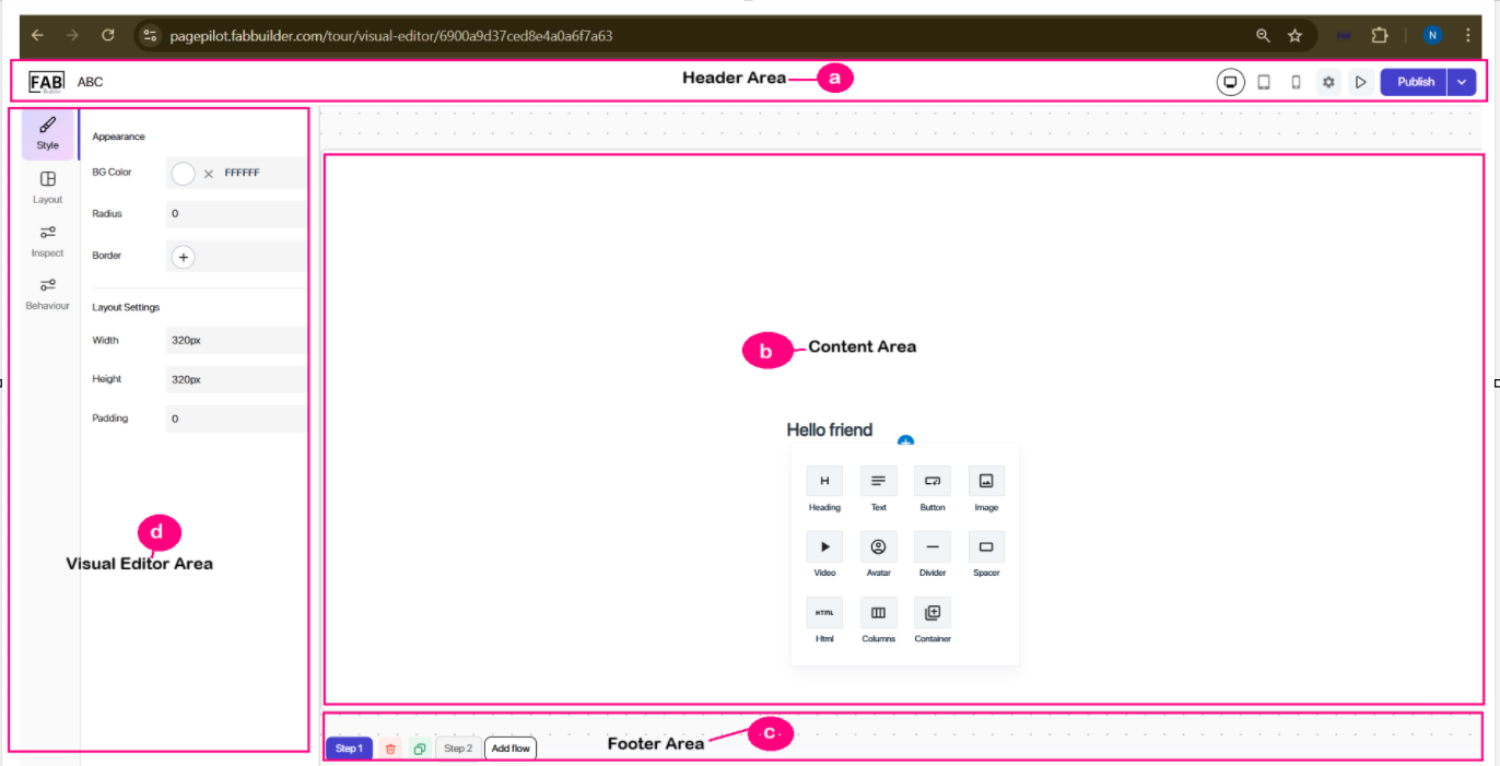
A screen of tour visual editor can be defined by dividing it into three areas such as header, Tooltip build and visual editor area ,footer which are described in detail as below.
Screen- Visual Editor Area
a. Header (Top Bar) – The top section of the tour screen displays key information from left to right:

Screen- Visual Editor Header
- Logo – The company logo is positioned at the extreme left of the screen. User can return to the main Tours dashboard clicking on it.
- Name of the Tour – Displays the name of the tour next to the logo.
- Device – Provides an option to select the device type (currently, Web is selected) to preview how the tooltip appears on different devices.
- Setting-Tab- This tab allows user to change the tour details. User can refer change tour setting section mention further.
- Preview – Allows users to test and view how the tooltip will appear during an actual walkthrough.
- Publish – Saves and activates the tooltip or tour for live use within the application.
- Dropdown Menu – This menu provides options to save the tour as a template or save it as a draft for future reference.
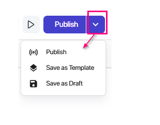
Screen- Drop down
b. Content Area (Centre)
This area allows the user to define the outline of the tooltip or tour before designing it.
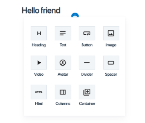
This is the starting point where a user can create or add a new tooltip. After hovering the cursor “+” button in the centre of the screen is visible. Clicking the “+” button displays a list of design elements on card that can be used to build the tooltip.
This card contains various design elements to create a basic template (skeleton) of the tooltip in the main area. Later, User can then edit and customize its content using the Tooltip Editor on the left side.
Screen-Design Element
The Tooltip build area which contains the following elements that can be added within the tooltip.
- Heading – Used to add a prominent title or headline text in the tooltip.
- Text – Allows adding descriptive or instructional text to provide context.
- Button – Adds a clickable button that can be linked to actions (e.g., next step, open link, submit).
- Image – Used to insert an image for visual explanation or branding.
- Video – Allows embedding of video content inside the tooltip for demonstrations or tutorials.
- Avatar – Adds a small profile-style image/icon (useful for showing a guide, character, or brand mascot).
- Divider – Inserts a horizontal line to visually separate different sections within the tooltip.
- Spacer – Provides empty space to adjust the layout and positioning of elements.
- HTML – Allows custom HTML code to be embedded for advanced customization.
- Columns – Splits the tooltip area into multiple columns to arrange content side by side.
- Container – A block used to group multiple elements together for structured layout and easy management.
Once user select the any of the available blocks, users can visually design and arrange their tooltip content. This design can be edited later by navigating tooltip editor area.
At footer of main screen, following button buttons are displayed.
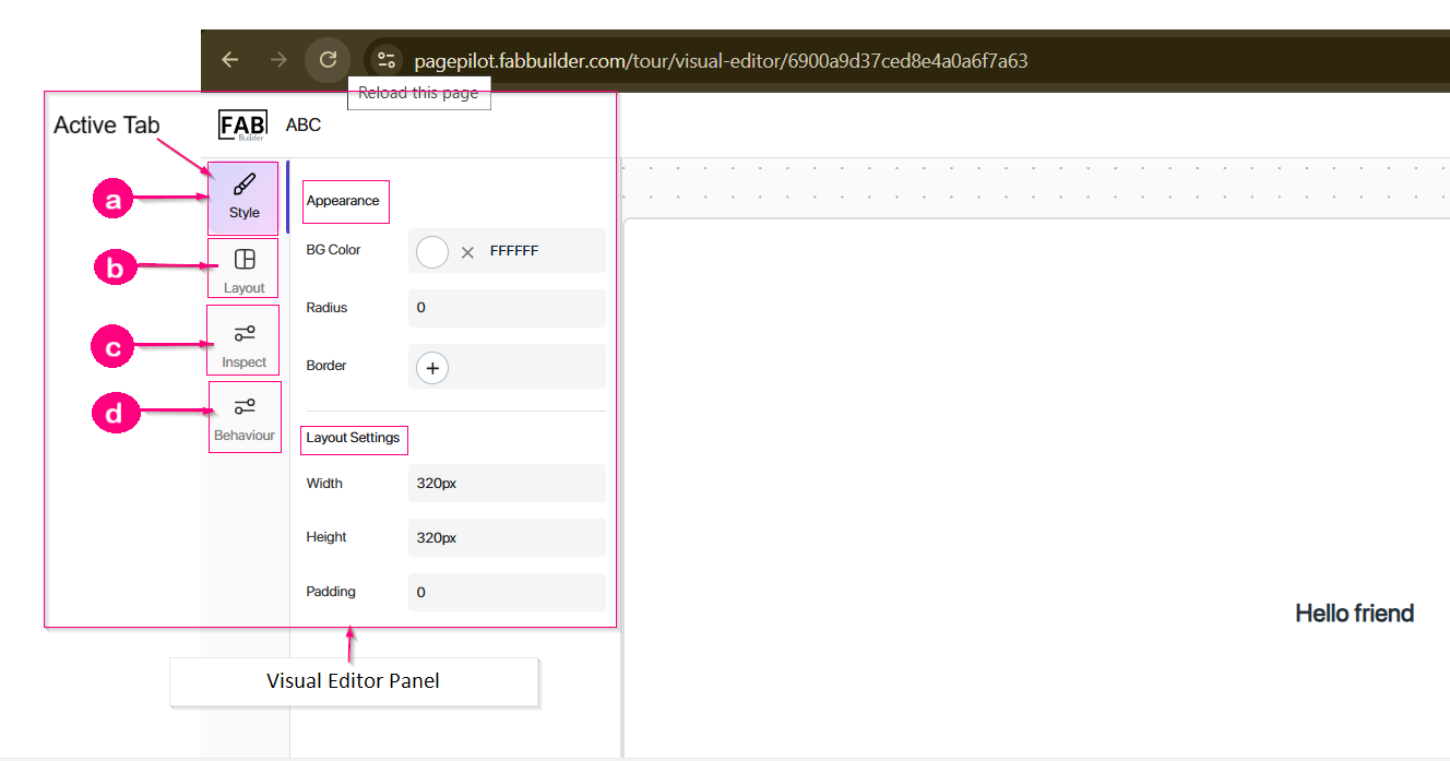
3. Visual Editor Area (Left Panel)
Screen- Visual Editor
Configuration Tabs
Three configuration tabs are displayed for editing and customizing tooltips:
a. Style Tab- This tab provides appearance-related options to design the tooltip. User can edit the following fields include:
Appearence
- Background colour-User can change the box colour of tour content box.
- Radius- Content box edges cab be changed with this tool.
- Border- Border of the colour can be changed with this tab.
Layout settings
- Height- Height of the content box can be changed.
- Width- Width of the content box can be changed.
- Padding-Size of box (height) can be changed with this.
b. Layout – This tab contains three more tabs.
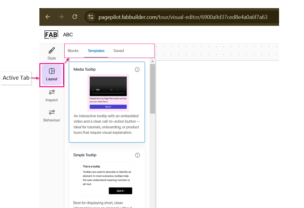
Screen-Layout tab/Visual Editor/Tour
- Block- User can drag and drop blocks to build tour layout. Choose from various components like headers, text blocks, images, buttons, and more.
- Template- All creates tour template which are saved globally can be viewed under this section.
- Saved- All creates tour template which are saved privately can be viewed under this section
c. Inspect Tab- This tab allows the user to inspect the selected block (tooltip step displayed on the Tooltip build Area). Users can edit or modify text, buttons, and
other content directly.
d. Behaviour Tab- It controls the functional properties of the tooltip of tour such as positioning or interaction behaviour, trigger behaviour, tooltip delay,dismiss setting, target element.
User can change the tour details by clicking on setting tab in visual editor screen. At header section user need to click on setting utton which redirect the user to tour setting page with other tabs to manage other details . All details of other setting tabs are mentione as follows.
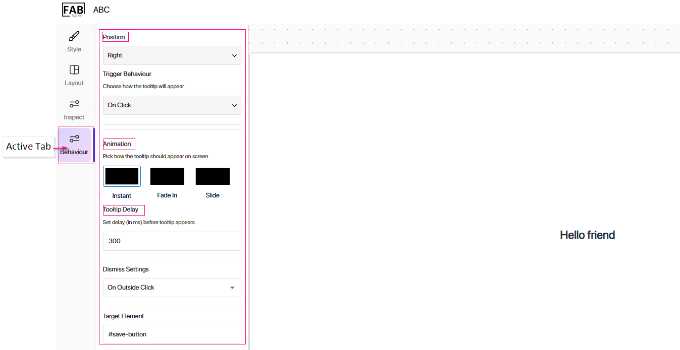
screen- Visual Editor/Behaviour/Tour
Change Tour Setting
User can change the tour seting by navigating visual editor screen of tour section. At header of the visual editor screen, user must click on setting tab which redirects the user to new screen of tour settings. This screen contains other tabs to manage the details of tour by setting them which are mentioned below.
1. Tour settings- User can change the all tour basic details such as name, page source, element ID, etc by clicking on this section tab.
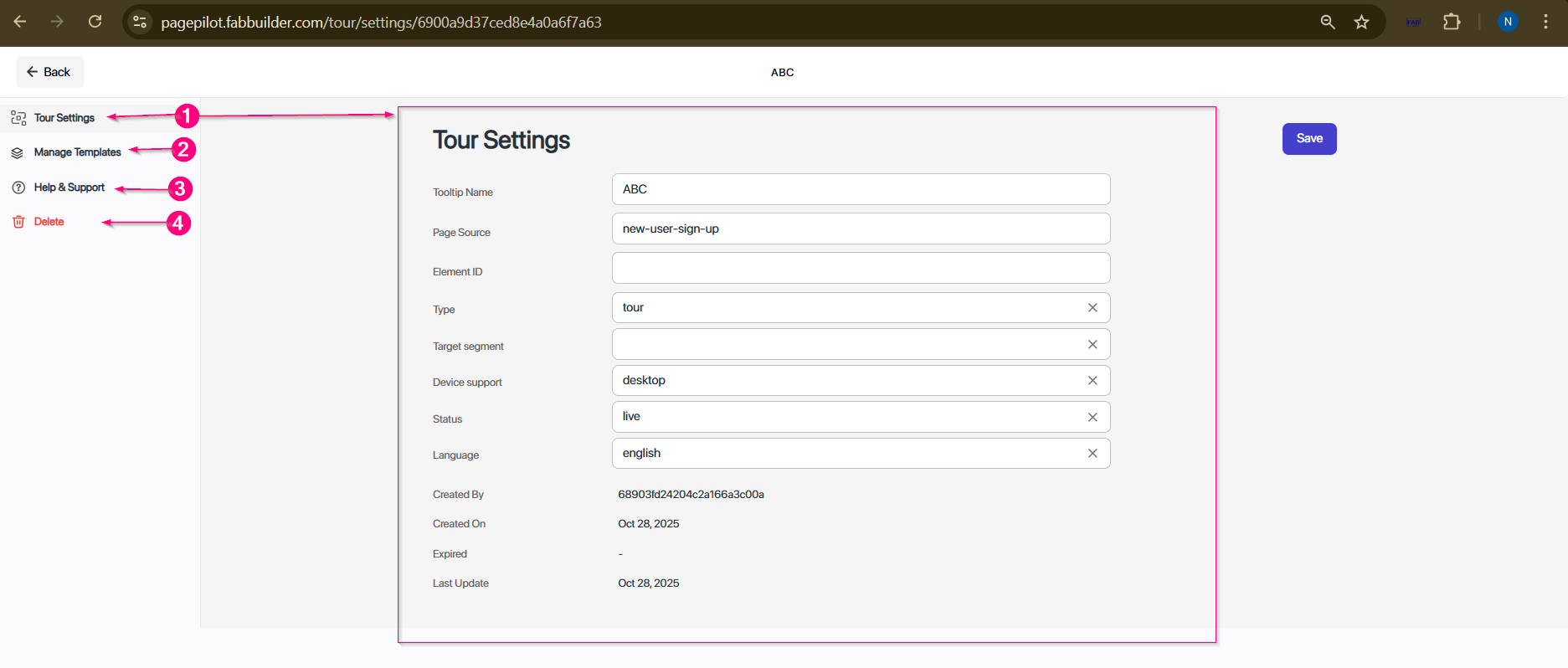
Change the Tour setting
2. Manage template- All privately save templates can be managed in this section.
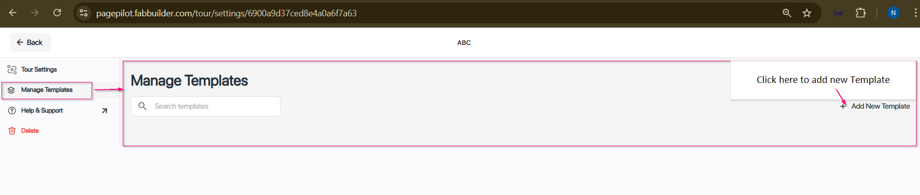
Screen- Manage Template setting
3. Help & Support- The Help & Support tab provides users with assistance options (message or call).
4.Delete- Allows user to delete the tour permanently.